Help me out, guys!!
I got buttons for the baby cardi. Two kinds. The first ones looked a little bit too yellow, so I got some white ones.
Now I can’t make up my mind.
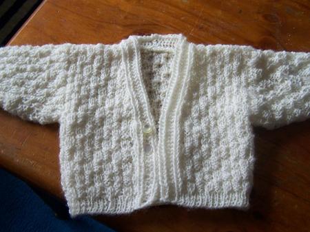
(Click for big)
The yellow or the white?
And in close up.
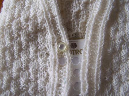
Help me out, guys!!
I got buttons for the baby cardi. Two kinds. The first ones looked a little bit too yellow, so I got some white ones.
Now I can’t make up my mind.
Oooh, am I first?!
I vote for white buttons. They blend in more, and bring the focus to the knitting.
I vote white!
I think white too.
Hmm I quite like both, but I think I’m leaning towards the white.
I like both too but I think the white because it blend in and doesn’t take away from the pattern. With the yellow button your eyes go straight to the button but with the white your eyes don’t. It’s a gorgeous pattern.
Very cute.
I’m going with the white.
white, white, white!
white, white, white!
I like the yelow best, but the white button looks better. I don’t know how that works, but it’s a white vote from me too!!
Um, green. No. Purple. Oh – righto – white then.
The yellow is prettier but the white goes better!
I vote yellow, actually…
I think the white ones are TOO white.
I like the top button best, but it looks like I’m outnumbered.
White!
I’d say if it were for a girl baby, I’d go with the yellow, and if it were for a boy or gender neutral baby, I’d go with the white.
I agree with the ladies…white 🙂
I just want to say it’s lovely!
Gotta go with the white – the people have spoken!
I feel the same as Sprite its ok for the yellow if for a girl but to be safe its def. white.
white white!!! You finished the cardi so fast! Having exams now so no much knitting around here siiighh
Ummm….the minority is voting here–Yellow! I like the look of the texture of the the yellow better with the texture of the sweater. The white is too flat, and possibly too white. Besides, if anyone complains about the yellow ones, you can always claim they’re “antique.” 😉
WHITE, fer sure! 🙂
I was going to vote yellow because I love the extra little detail, but maybe it would be a bit distracting from the actual knitting and we all know that that wouldn’t be good 😉
Of course the baby wearing the cardi will be distracting as well.
So I say white, officially 🙂
white.
Twinkie white!
the white…it doesn’t distract from the cardi….
I like the yellow better, the white ones are too plain and white in my opinion. The yellow ones are more chic.
Danielle
I like both too but would probaly go white!
Definately the yellow ones. I think they stand out better, and I love the edging on them too.
I like the yellow, they are different. The white seemed too flat. Either will be fine, you will just have to make another sweater for the yellow buttons. It is a cute sweater.
i prefer the yellow. i think the white is too white for the cardy 😛
Have to say both are nice, but I’m leaning toward th yellow. They pop more and complement the pattern.
Yellow! 🙂
Yellow! 🙂
White.
I like the white because I like the buttons to blend in unless they’re very unique and I want them to stand out. If I found little flowers or lady bugs or trains or space ships as buttons, then I’d want to have people concentrate on that.
I like the yellow ones best because I think that buttons are just as important as the knitting and the white ones are too plain. The yellow ones compliment the sweater and stand out. I have designed entire sweaters around buttons.
white
If you could get the yellow ones in white I would vote that (cos the yellow ones look better in button design..but the white ones suit the caridgan better).
So..short of having that option. I say white.
Katt
Well, Katt summed it up nicely for me. 🙂 I can see from the comments that white seems to be the slight favorite. Did that help you make your choice?